By Susan Saldibar
People leave your website for a variety of reasons. But here’s one that always seems to make the top 5 lists: They will leave if they can’t quickly get to the information they want. They’ll also be turned off if the only CTA they see is “schedule a tour” or “chat now”, without any other choices in between.
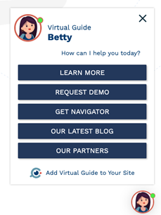
So that leaves you with the challenge of how to give them meaningful choices, all in one place, without making them paw through a bunch of tabs and landing pages. AgingChoices (a Foresight partner) has the answer in its newly released Navigator. It’s a fully customizable Virtual Guide with a menu of choices that will pop up on any page of your website. It lets you control what you want visitors to see and gives them choices as to how they want to interact.
 Get Them Into a Funnel, Not All Over the Page
Here are some of the key capabilities AgingChoices has built into Navigator:
- Lets you build a custom CTA “ecosystem” of choices for visitors.
- Drives prospects into a sales/marketing funnel.
- Can be easily branded to your community or agency.
- Integrates with the AgingChoices ProSurveys, 3rd party chats, and other engagement options.
- Keeps visitors on your website longer.
- Helps build trust with your brand.
- Saves you money on testing CTAs instead of doing a complete website revamp
“You can put all your CTAs right up on top of the screen where you want them,” VP of Product for AgingChoices Brandon Compagna says. “If they want pricing, it’s a simple click to get there. If you want to offer live chat or to engage them in taking a survey, it’s easy with Navigator.” And, what’s cool is that you can even have an “employment” button to quickly get job seekers out of your funnel and onto a page where they can then apply.
Providing pop-up choices also demonstrates a willingness to share information without requiring a phone call from you. That helps build trust. And it helps increase the odds that, if they like what they see, they will feel more comfortable leaving their contact information. “You want to get those visitors into a funnel, versus all over the page,” Brandon says. “This lets you test out lots of CTAs on the website without impacting performance.”
Give Them a Personal Path
Brandon describes Navigator as a hub, storing all your CTAs and options in a way that lets you tailor each page as a potential stepping stone to more information and, ultimately, a connection. Terri Sullivan, AgingChoices co-founder, feels that this accomplishes key objectives that are so necessary in today’s technology-engaged world. “It lets people decide how they want to engage with your site,” she says. “It gives them a personal path towards the information they are looking for and more importantly makes them feel like they are in control of the process.”
“We started AgingChoices to improve and personalize the experience of consumers looking for senior housing and care,” Terri says. And by improving the experience, you are in effect keeping them engaged longer. And, every added second counts. “The goal of providers is to convert the consumer website visitor into a conversation and get them into your funnel. Creating CTAs that engage do just that.”
Navigator has just rolled out, with some pretty awesome enhancements on the way as well. You can learn more about Navigator and schedule a demo by visiting the Navigator webpage.