A few of you have rather gently suggested Senior Housing Forum could use a new logo.
A few of you have rather gently suggested Senior Housing Forum could use a new logo.
A couple of others have been more blunt telling me that it is terrible. Even the friend who created the current logo thinks it’s terrible. I engaged Zoomer Marketing to help create a new logo and identity.
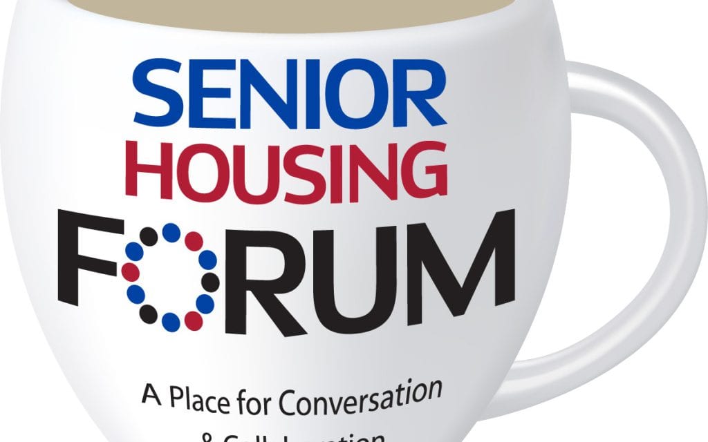
Here are 5 logo choices. What do you like best and why?

Logo 1

Logo 2

Logo 3

Logo 4
 Logo 5

Logo 6
In the comments section below tell us which one you like best and feel free to add any comments good or bad about any of them.
Steve
Zoomer Marketing Inc. was founded by Elisa Wilson Prashad a graduate of OCADU, Toronto’s leading design institution. She has held the senior marketing role with several national senior housing companies including Revera, AMICA,Mature Lifestyles and Origin. Zoomer, based in Toronto was launched in 2004 and is focused on reaching the 55+ crowd.


4 and 2 in that order. 4 is clear and visually relates to your subject matter in its simplest form. 2 emphasizes Senior more than the other name elements but its design interjects some fun into serious subject. The talk balloons may be common elements but they are readily understood.
Why don’t you have the readers submit their ideas to you and then we select one. I am sure there are many creative readers that would be more than happy to give it a shot!
I like #4 then #5. Although the light blue print is more difficult for seniors to see…and all of us are aging!!
I am not a big fan of any of those options. I would recommend going to http://www.99designs.com. you can get a very high quality logo for a very reasonable price. And no, I do NOT work there, just a big fan of their service.
All look dated and unimaginative. Seems like you are putting too much into a single logo. Logo’s should be symbolic of your organization and not tell the whole story. Simplify, simplify!
Of the options shown #2 seems best, although they all seem a bit cartoonist, which seems to be the way media is going these days.
None of them draw me to look further. They have a cartoon feel and not a professional look. The coffee cup has potential but needs a major review. The dotted “O” is one thing that I don’t understand. Maybe taking the wording style from #4 and add it to the coffee mug may work.
I like #4 the best. I think #5 is too “busy”. #1 feels dated. #2 without the yellow maybe ok.
Good luck!
#2 & 4, I think 4 might be easier when printing due to colors??? Much more friendly!
Of the options provided, I like 2 followed by 4.
I like #4, it is clear and definitely eye catching.
They are all a huge improvement over what you have now! The only one I didn’t love was #1. I like 2, 3 is nice, big and easy to read, 4 is probably the most direct logo for what you are trying to say – and 5 gives a bit more whimsical side to the logo. Good luck!
Out of these five I would go with the 2nd one.
If it’s a choice from the above, 4. It’s simple and direct. From what I can see is that your target audience are industry peers so this is a great idea to help with the selection process.
Good Luck.
Number 1 is warm, inviting, and personal. Let us know the ranking of all.
Best Regards…..
I like 2 and 4 the best.
I definately like 1! You have opportuntiy to be creative in the future with this. Much like the google logo that morphs on special occasions, you can play with your cup and contents to keep things interesting.
I like #5. It’s clean, crisp, today, yet fun.
Steve
I favor #4 as it on point but light and fun.
I empathize with you as we are going through the exact same exercise.
Best of luck.
Ummm… I’d start all over again and give it another try!!!
2 and 4 make me think of the side mirror on the a car – if you made the “mirror” into the house shape like in 5, I would then pick 2.
From LinkedIn Groups
I like #2 and #3 the same, however I prefer the color scheme on #2 MUCH BETTER than the colors on #3. The lighter blue and tangerine are much brighter, fresher than the blue/maroon.
good luck
By Steffani Adaska
From LinkedIn Groups
I like #5. It’s clean, crisp, young, light and inviting. That’s my thought.
By Evan A. Kaplan
From LinkedIn Groups
My preference is #2 then # 4. The colors are pleasant and get away from the red, white, black which are overused.
By Joan Painter, CFE, ALA
From LinkedIn Groups
I like #1 it seems inviting, safe and comfortable
By Lori La Bey
From LinkedIn Groups
I like #1 because the “coffee cup” invites conversation; My second choice would be #5.
By Leah Nelson
I’d look for more options – some a bit “comic” like – needs a more professional “feel”
Logo 2 or 4!
I just added a sixth idea
4 – it says “housing” and it is the most versatile
Six seems the best….and it is too busy….just use words…font that is classic…
I like #4 and #6,
Good luck Steve….whatever you choose will be great.
Best regards, P.K.
I like #5
I have to agree that none of the logos really catch my attention in either art or color.
Having just gone through a logo redesign, I’ve learned that it is a process not just a choice. If there are clear favorites, I suggests that you have your designer take those and see if they can be further developed.
suggestion: readability is crucial. at the size shown everything looks okay, bring it down to the smallest size your readers will see your logo and see what happens.
#4 and then #1
In my opinion:
#4 really got my attention and seems to have the most advertising appeal.
#2 seems warm and inviting; giving you the feeling of honesty and openness.
#5 is my first choice-looks modern and ‘with it’. #4 is my runner-up but still eye-friendly!
Steve- Thank you for all your efforts. I like # 5 the best because of the various vibrant colors, font styles plus the mixture of upper and lower case words….it’s a modern and upbeat statement about our group!!!
As an artist and having worked in Ad agencis the visual of #4 is by far the best….in my opinoin. Simple and clearly understood at a glance.
First of all I’m new here and have enjoyed the conversations. Thanks for this great forum.
My vote is for #4 also.
I appreciate all the votes and comments. Interestingly enough it was a reader comment that helped me finalize the decision. Since I have made the decision, I am closing comments. Next week I will do a short article on why I choose what I chose, but the header on the website and the most current email sort of says it all.